Tabs
The following page documents visual specifications such as color, typography, structure, and size.
Color
Line tab color
| Type | Element | Property | Color token |
|---|---|---|---|
| Unselected | Tab | background-color | transparent |
| border-bottom |
| ||
| Label | text-color |
| |
| Icon | svg |
| |
| Selected | Label | text-color |
|
| Icon | svg |
| |
| Tab | border-bottom |
|
- Denotes a contextual color token that will change values based on the layer it is placed on.
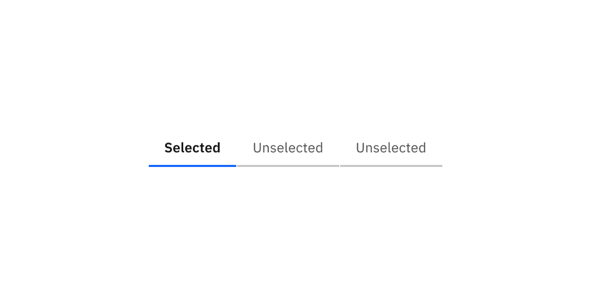
Example of selected and unselected line tabs.
Line tab interactive state color
| State | Element | Property | Color token |
|---|---|---|---|
| Hover | Label | text-color |
|
| Icon | svg |
| |
| Tab | border-bottom |
| |
| Focus | Tab: unselected | border |
|
| Tab: selected | border |
| |
| Disabled | Label | text-color |
|
| Icon | svg |
| |
| Tab | background-color | transparent | |
| border-bottom |
|
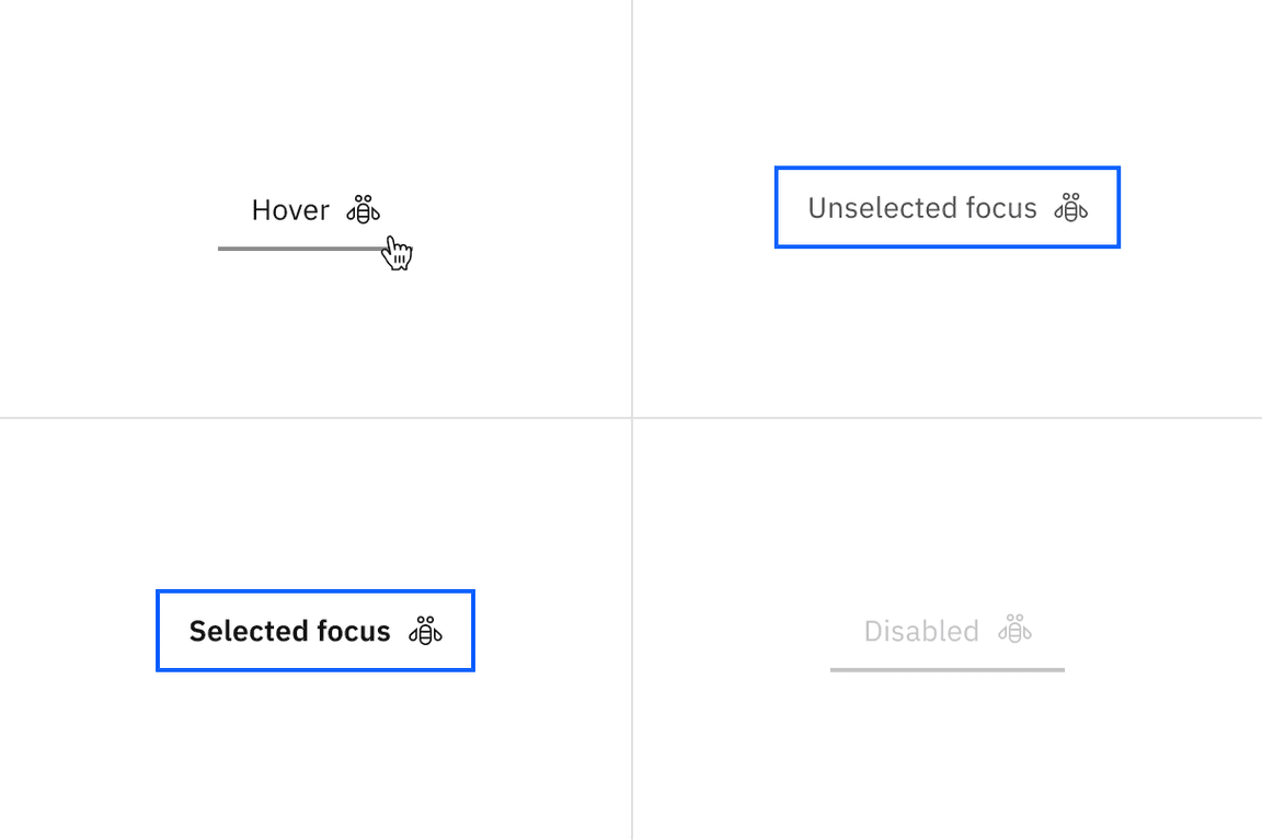
Examples of hover, unselected focus, selected focus, and disabled states for line tabs.
Line tab scrollable states
| State | Element | Property | Color token |
|---|---|---|---|
| Enabled | Icon | svg |
|
| Button | linear-gradient |
| |
| background-color |
| ||
| Hover | Button | background-color |
|
| Active | Button | background-color |
|
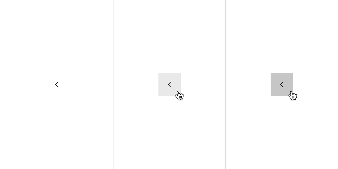
Examples of enabled, hover, and active states for scrollable line tabs.
Dismissible line tab color
| Type | Element | Property | Color token |
|---|---|---|---|
| Unselected | Tab | background-color | transparent |
| border-bottom |
| ||
| Label | text-color |
| |
| Icon | svg |
| |
| Selected | Label | text-color |
|
| Icon | svg |
| |
| Tab | border-bottom |
|
- Denotes a contextual color token that will change values based on the layer it is placed on.
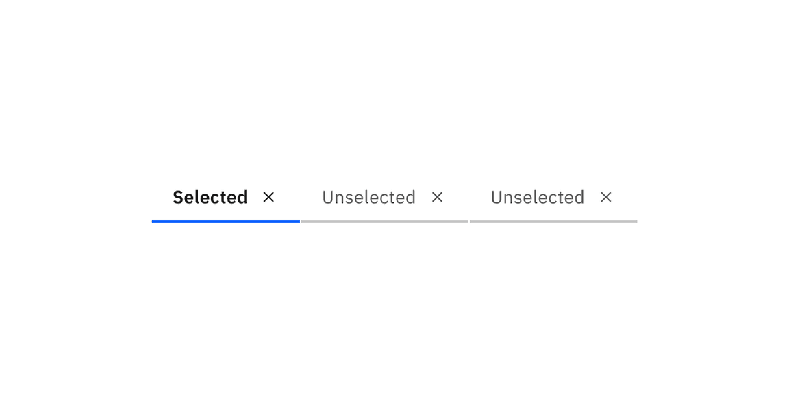
Example of selected and unselected dismissible line tabs.
Dismissible line tab interactive state
| State | Element | Property | Color token |
|---|---|---|---|
| Hover | Label | text-color |
|
| Icon | svg |
| |
| background-color |
| ||
| Tab | border-bottom |
| |
| Focus | Tab: unselected | border |
|
| Tab: selected | border |
| |
| Disabled | Label | text-color |
|
| Icon | svg |
| |
| Tab | background-color | transparent | |
| border-bottom |
|
- Denotes a contextual color token that will change values based on the layer it is placed on.
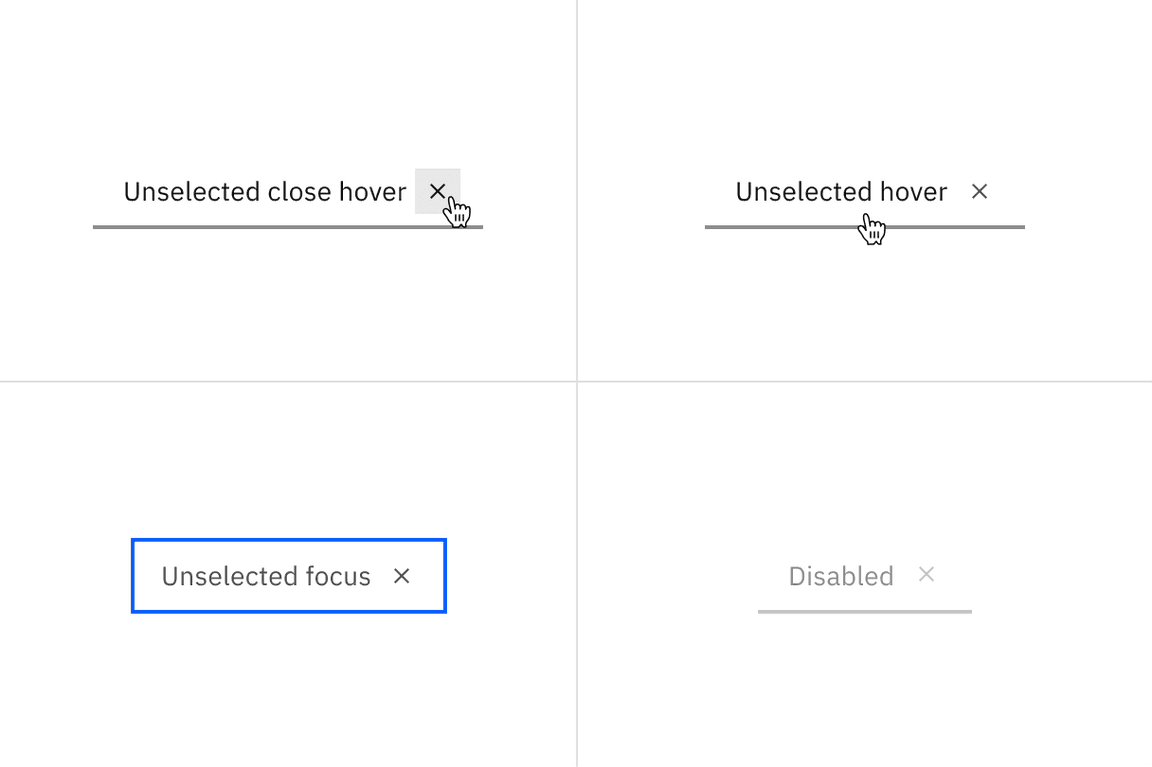
Examples of unselected close hover, unselected hover, unselected focus, and disabled states for dismissible line tabs.
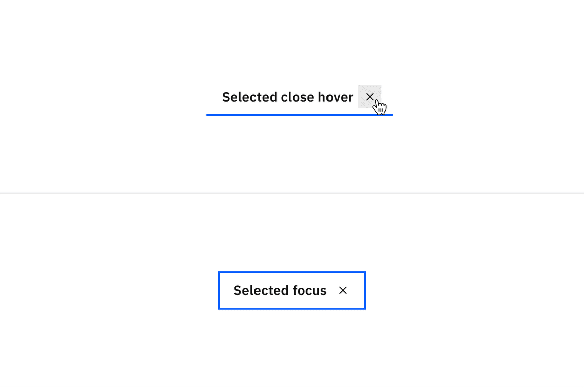
Examples of selected close hover and selected focus states for dismissible line tabs.
Contained tab color
| Type | Element | Property | Color token |
|---|---|---|---|
| Unselected | Tab | background-color |
|
| border-right |
| ||
| Label | text-color |
| |
| Secondary label | text-color |
| |
| Icon | svg |
| |
| Selected | Tab | background-color |
|
| border-top |
| ||
| Label | text-color |
| |
| Secondary label | text-color |
| |
| Icon | svg |
|
- Denotes a contextual color token that will change values based on the layer it is placed on.
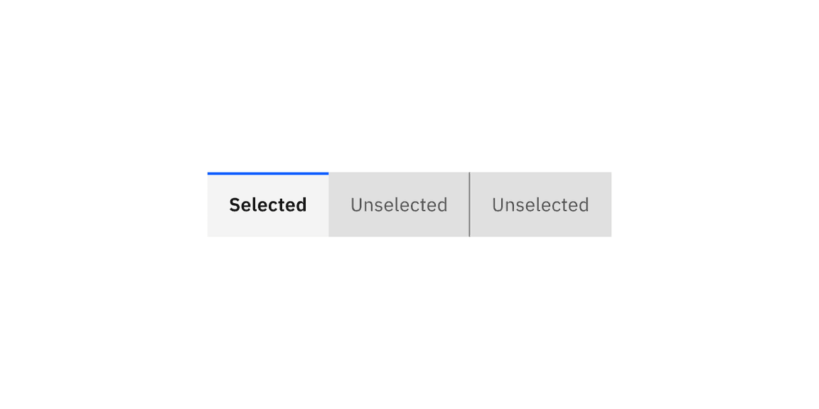
Examples of selected and unselected contained tabs.
Contained tab interactive state color
| State | Element | Property | Color token |
|---|---|---|---|
| Hover | Tab | background-color |
|
| Label | text-color |
| |
| Secondary label | text-color |
| |
| Icon | svg |
| |
| Focus | Tab | border |
|
| Disabled | Label | text-color |
|
| Secondary label | text-color |
| |
| Icon | svg |
| |
| Tab | background-color |
|
- Denotes a contextual color token that will change values based on the layer it is placed on.
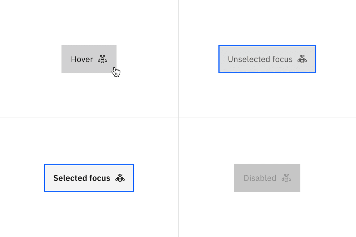
Examples of hover, unselected focus, selected focus, and disabled states for contained tabs.
Contained tab scrollable states
| State | Element | Property | Color token |
|---|---|---|---|
| Enabled | Icon | svg |
|
| Button | background-color |
| |
| Hover | Button | background-color |
|
| Icon | svg |
| |
| Active | Button | background-color |
|
- Denotes a contextual color token that will change values based on the layer it is placed on.
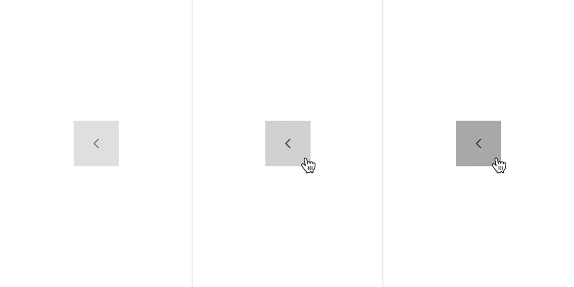
Examples of enabled, hover, and active states for contained scrollable tabs.
Dismissible contained tab color
| Type | Element | Property | Color token |
|---|---|---|---|
| Unselected | Tab | background-color |
|
| border-right |
| ||
| Label | text-color |
| |
| Icon | svg |
| |
| Dismissible icon | svg |
| |
| Selected | Tab | background-color |
|
| border-top |
| ||
| Label | text-color |
| |
| Icon | svg |
| |
| Dismissible icon | svg |
|
- Denotes a contextual color token that will change values based on the layer it is placed on.
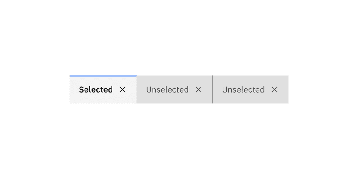
Examples of selected and unselected dismissible contained tabs.
Dismissible contained tab interactive state color
| State | Element | Property | Color token |
|---|---|---|---|
| Hover | Tab | background-color |
|
| Label | text-color |
| |
| Icon | svg |
| |
| Dismissible icon | svg |
| |
| Dismissible icon: selected | background-color |
| |
| Dismissible icon: unselected | background-color |
| |
| Focus | Tab | border |
|
| Disabled | Label | text-color |
|
| Icon | svg |
| |
| Tab | background-color |
|
- Denotes a contextual color token that will change values based on the layer it is placed on.
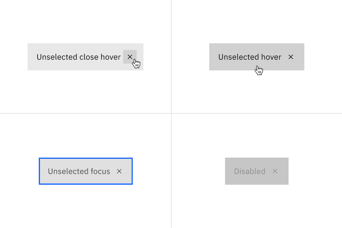
Examples of unselected close hover, unselected hover, unselected focus, and disabled states for dismissible contained tabs.
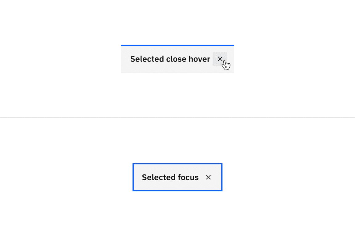
Examples of selected close hover and selected focus states for dismissible contained tabs.
Vertical tab color
| Type | Element | Property | Color token |
|---|---|---|---|
| Unselected | Tab | background-color |
|
| border-bottom, border-right, border-left |
| ||
| Label | text-color |
| |
| Extended background | background-color |
| |
| border-right |
| ||
| Selected | Tab | background-color |
|
| border-bottom |
| ||
| border-left |
| ||
| Label | text-color |
| |
| tab panel | background | background-color |
|
- Denotes a contextual color token that will change values based on the layer it is placed on.
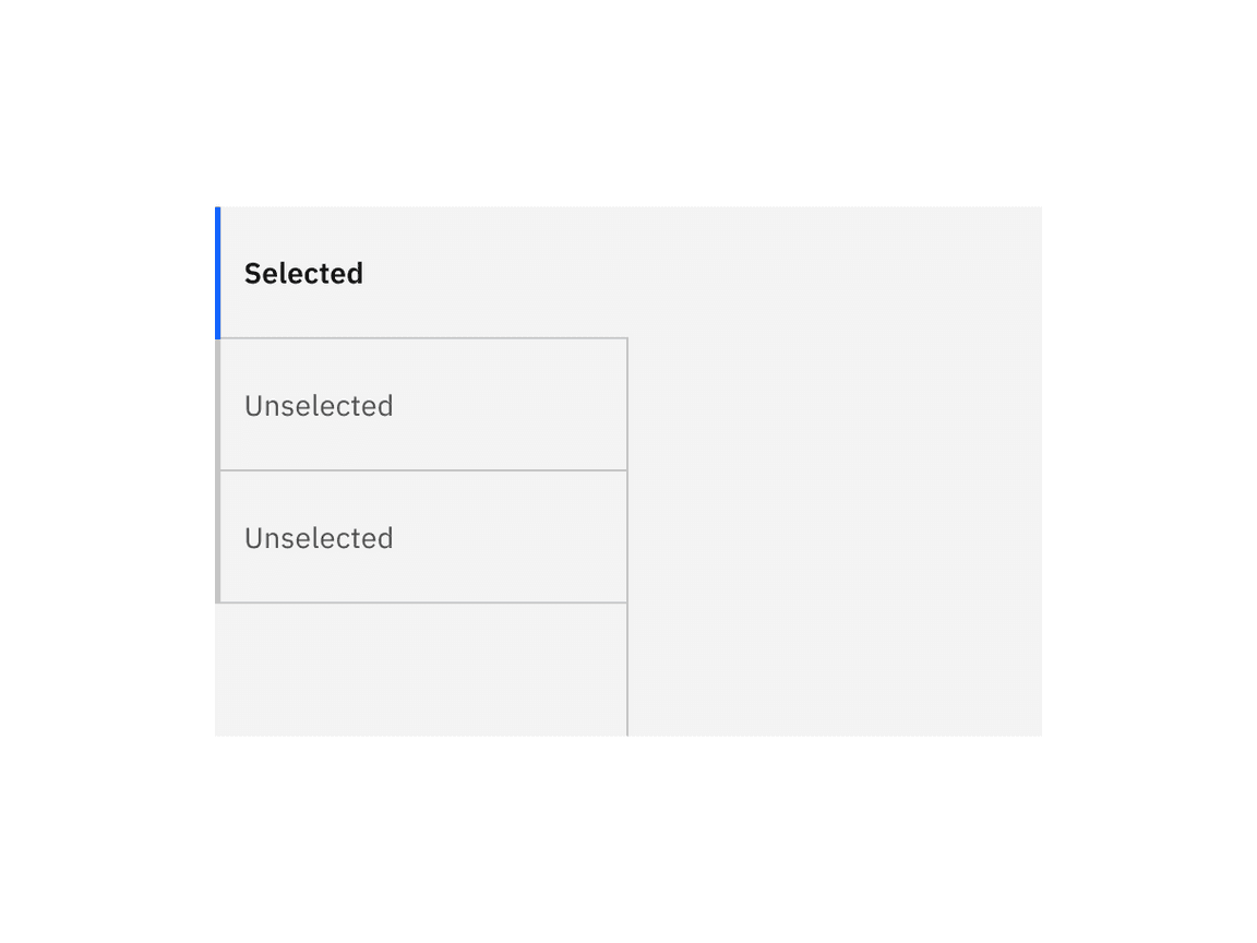
Examples of selected and unselected vertical tabs.
Vertical tab interactive state color
| State | Element | Property | Color token |
|---|---|---|---|
| Hover | Label | text-color |
|
| Tab | background-color |
| |
| Focus | Tab: unselected | border |
|
| Label: unselected | text-color |
| |
| Tab: selected | border |
| |
| Label: selected | text-color |
| |
| Disabled | Label | text-color |
|
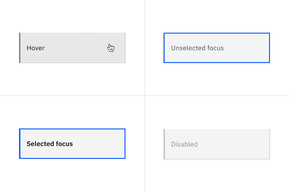
Examples of hover, unselected focus, selected focus, and disabled states for vertical tabs.
Typography
Tab labels should be set in sentence case, and should not exceed three words.
| Element | Font-size (px/rem) | Font-weight | Type token |
|---|---|---|---|
| Label: unselected | 14 / 0.875 | Regular / 400 |
|
| Label: selected | 14 / 0.875 | SemiBold / 600 |
|
| Secondary label | 12 / 0.75 | Regular / 400 |
|
Structure
Line tab structure
| Element | Property | px / rem | Spacing token |
|---|---|---|---|
| Tab | height | 40 / 2.5 | – |
| border-bottom | 2px | – | |
| width | auto-width | – | |
| margin-left | 1px | – | |
| Label | padding-left, padding-right | 16 / 1 |
|
| padding-top, padding-bottom | 8 / 0.5 |
| |
| Icon | padding-right | 16 / 1 |
|
| padding-left | 8 / 0.5 |
| |
| svg | 16 x 16 | – | |
| Scrollable icon | svg | 16 x 16 | – |
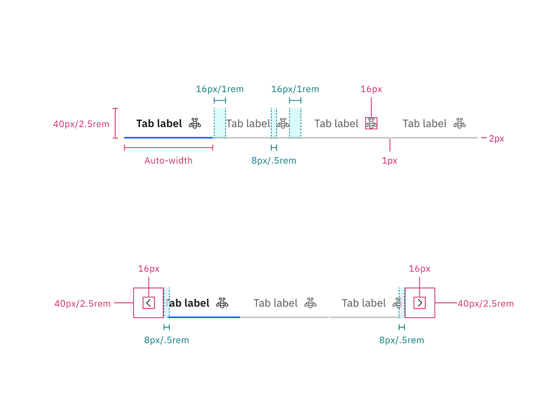
Structure and spacing measurements for line tabs | px / rem
Line tab icon-only modifier
| Element | Property | px / rem | Spacing token |
|---|---|---|---|
| Tab (md) | height, width | 40 / 2.5 | – |
| svg | 16 x 16 | – | |
| Tab (lg) | height, width | 48 / 3 | – |
| svg | 20 x 20 | – |
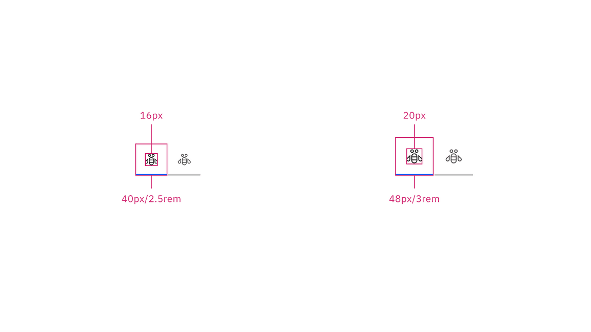
Structure and spacing measurements for icon-only line tabs | px / rem
Dismissible line tab structure
| Element | Property | px / rem | Spacing token |
|---|---|---|---|
| Tab | height | 40 / 2.5 | – |
| border-bottom | 2px | – | |
| width | auto-width | – | |
| margin-left | 1px | – | |
| Label | padding-left, padding-right | 16 / 1 |
|
| padding-top, padding-bottom | 8 / 0.5 |
| |
| Dismissible icon | padding-right | 16 / 1 |
|
| padding-left | 8 / 0.5 |
| |
| svg | 16 x 16 | – | |
| Icon | padding-right | 8 / 0.5 |
|
| padding-left | 16 / 1 |
| |
| svg | 16 x 16 | – |
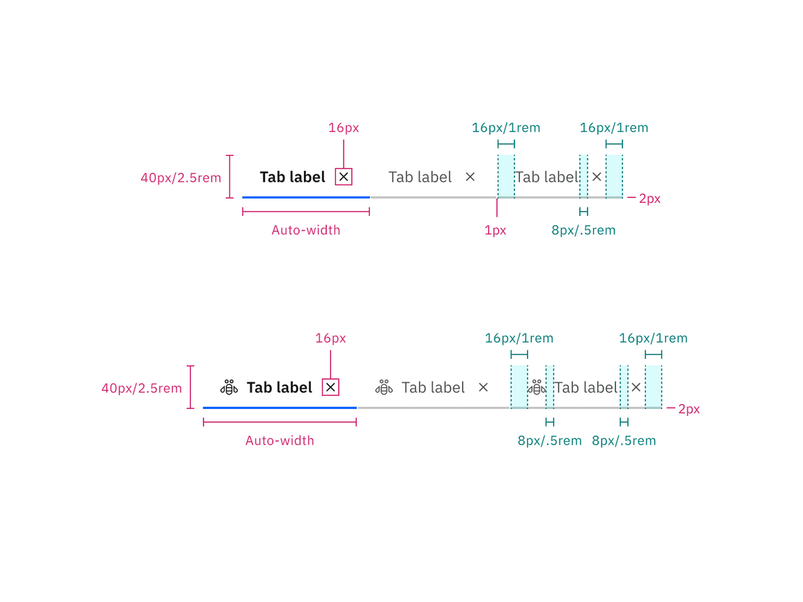
Structure and spacing measurements for line tabs without icons (top) and with icons (bottom) | px / rem
Contained tab structure
| Element | Property | px / rem | Spacing token |
|---|---|---|---|
| Tab | height | 40 / 2.5 | – |
| border-top | 2px | – | |
| width | auto-width, grid | – | |
| Label | padding-left, padding-right | 16 / 1 |
|
| Icon | padding-right | 16 / 1 |
|
| padding-left | 16 / 1 |
| |
| svg | 16 x 16 | – | |
| Tab | border-right | 1px | – |
| Scrollable icon | svg | 16 x 16 | – |
| Scrollable button | border-right, border-left | 1px | – |
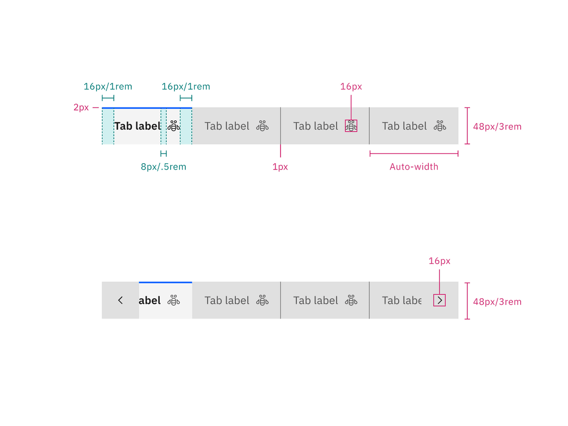
Structure and spacing measurements for contained tabs | px / rem
Contained tab icon-only modifier
| Element | Property | px / rem | Spacing token |
|---|---|---|---|
| Tab (lg) | height, width | 48 / 3 | – |
| svg | 20 x 20 | – |
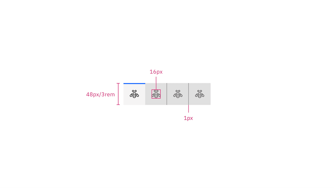
Structure and spacing measurements for icon-only contained tabs | px / rem
Dismissible contained tab structure
| Element | Property | px / rem | Spacing token |
|---|---|---|---|
| Tab | height | 40 / 2.5 | – |
| border-top | 2px | – | |
| width | auto-width, grid | – | |
| Label | padding-left, padding-right | 16 / 1 |
|
| Dismissible icon | padding-right | 16 / 1 |
|
| padding-left | 8 / .5 |
| |
| svg | 16 x 16 | – | |
| Icon | padding-right | 8 / .5 |
|
| padding-left | 16 / 1 |
| |
| svg | 16 x 16 | – | |
| Tab | border-right | 1px | – |
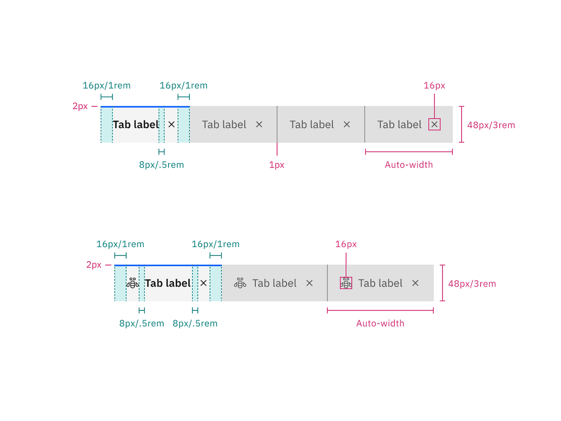
Structure and spacing measurements for dismissible contained tabs without icons (top) and with icons (bottom)| px / rem
Verical tab structure
| Element | Property | px / rem | Spacing token |
|---|---|---|---|
| Tab | height | 64 / 4 | – |
| border-left | 3 px | – | |
| Tab: unselected | border-bottom, border-right | 1 px | – |
| Tab: selected | border-bottom | 1 px | – |
| Label | padding-left, padding-right | 16 / 1 |
|
| Extended background | border-right | 1 px | – |
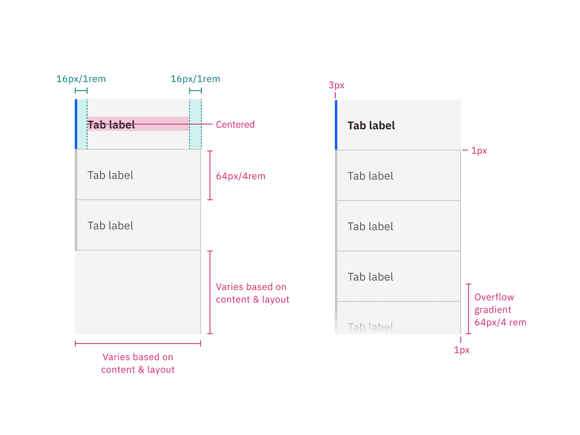
Structure and spacing measurements for vertical tabs without overflow (left) and with overflow (right) | px / rem
Feedback
Help us improve this component by providing feedback, asking questions, and leaving any other comments on GitHub.